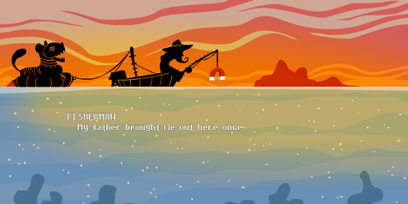
Maybe the biggest problem with not doing the art for a project is, I don’t get to make posts with cool screenshots all the time! I have to use placeholder stuff occasionally while I’m working, especially when I’m trying out new ideas. Like this placeholder font here:
There are conversations between the fisherman and tiger in this game, one per level. We started off trying something unusual; when you finished a level, the camera would pan left and up and text bubbles would appear above them with their conversation.
The problem was, this wasn’t really providing a good sense of closure when you finished the level. I had the conversation synced to a bit of ambient music to make it more interesting, but that just meant it was unskippable! That’s no fun when you have to replay a lot.
So I’m trying something more conventional now, with confidence in the knowledge that it’ll sort of work. I’ve shifted the conversations to the start of each day/level, and reckon the end will work better with a dramatic “clear” splash to punctuate success.
It’s a less original structure, but don’t knock it if it works, right? 😀 Now I’m building the game back up in this style, and it should come together more easily.
