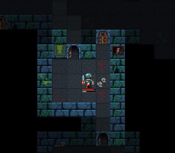
Cardinal Quest’s tilemaps were pretty straightforward. Each 16×16 tile was a different image: wall, floor, door, stairs. The boundaries between tile types didn’t affect the graphics at all.
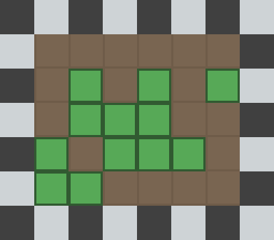
If we apply this approach to forests, we’d end up with Forest Tiles and Not Forest Tiles. Something like this (though obviously with better art):
That’d work, sure. But we can do better.
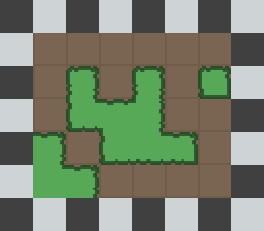
The approach I’ve decided to take is to stick with 16×16 tiles generally, but allow applying a variation to just a quarter of a tile – meaning the system can use 8×8 tiles where it counts.
This tileset:
…gives this effect:
So we start to get these cool visual regions, instead of things feeling so blocky.
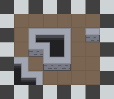
However… we can do better than that, and use our cheeky 8×8 tile system to produce an isometric effect.
So we can improve our walls like this and everything! So long as we’re careful not to muck up and make it look like an 8×16 area is something you should be able to walk on or anything weird like that, I think we’re in the clear. 🙂
I’m adding a few other features to the tile system, like support for free-standing props like tables and chairs where you can see the ground underneath, but this is probably the funnest. Corner tiles to handle boundaries nicely are a pain in the arse in any tile system, but breaking each tile down into four smaller tiles means the number of variations you have to specify to get nice borders is cut dramatically.


