Fixed ’em.
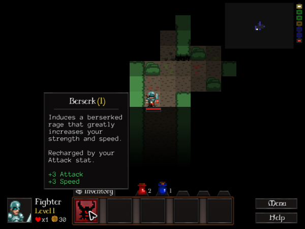
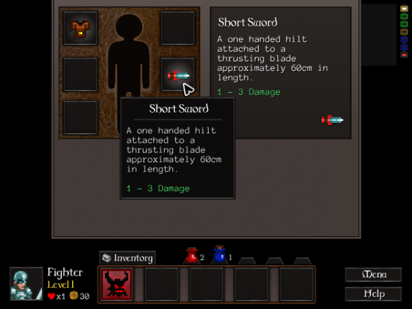
I wanted to get a whole lot more information in there, have them be prettier and more readable and feel more solid. I think this is maybe 60% of the way there. I’ve drawn some inspiration from Diablo 3, which has huge chunky popups that tell you everything; I haven’t gone quite as crazy as they did, though. There’s only so much you can do in 640×480.
I’ve started taking information that shows up in various panes in the current UI and moving it into popups:
It’ll now show you what potions and spells do (see the first shot) without you having to open the Inventory screen. More importantly, this’ll let me drop what’s left of the Inventory screen – those six equipment boxes – into the Character screen and get rid of the Inventory button altogether. Here’s to a cleaner, more informative UI. 😀

