It’s theory time again! Inspired by a TIGSource forum post, I’ve been thinking about the question: how do you make your game’s controls fun?
See, not every game needs tight, fun controls. Sometimes they can be destructive to the experience you’re creating. Sometimes you’re after deeper gameplay which conflicts with the simplicity and immediacy of great controls.
But most of the time, we want pressing buttons to feel awesome – and there’s a good few ways I can think of to achieve that 🙂
Starting with the basics:
1 – Responsiveness
When you apply an input, the effect should be immediate. Delayed effects feel sluggish and disconnected from your actions.
This is plain old cognitive science. How close do an action and a result have to be in time for the brain to assess them as a single event?
It turns out they have to be pretty close. The Perception of Cross-Modal Simultaneity is a pretty cool paper on this topic and shows that, in order for 50% of people to perceive hitting an object and hearing a sound as the same event, the sound needs to come within about 80ms of the impact event.
This has ramifications in design – like avoiding slow-to-respond animation systems, or signalling immediate responses to player input with sounds and sparkles even if the effects will take a while to show up – but it’s mostly a technical problem. A game running at 30fps might take 33ms to notice the button press. If it immediately plays the sound back, it could easily be pushing it into a sound buffer that’s 40ms or longer. That’s already 73ms… and it hasn’t even reached the sound card yet.
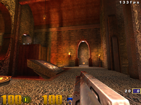
The situation’s even worse in video. You might not have a sound buffer to worry about, but graphics cards can queue multiple frames and both LCDs and CRTs take time to refresh. If John Carmack can only get a visual change in response to a button press on a 40ms delay with ideal hardware, you’re going to have your work cut out for you to even get close – especially since you’ve got all your update code and all your rendering code sitting between that button press event and handing things over to the graphics driver.
Going back to that paper: if you want 80% of people to perceive the response as simultaneous with the button press, you probably don’t have eighty milliseconds. You have thirty.
Good luck. 🙂
2 – Significance and empowerment
These are maybe two different factors but I’ve lumped them together. They’re essentially about making the effect of the button press way awesome.
(screencap from here)
Effects feel better when more happens. Sounds, particle effects and dramatic punchy animation all contribute to significance. This single aspect is most of the “juiciness” concept and is all about locking in on that feeling that your actions have had really big consequences.
As for empowerment, this runs deep. People will generally prefer control response which flatters and empowers them rather than the reverse. Crackdown doesn’t have particularly great controls but you can jump up the side of buildings and throw cars; that’s fun. Driving and shooting games routinely apply the same logic, even “simulation” driving games with their various assists.
Since the dawn of gaming we’ve been mowing down armies, coming first and kicking arse all the way, and the balance between empowerment and realism defines the spread of entire genres: Bulletstorm to ArmA, Need For Speed to rFactor, THPS to Skate, Dragon Ball Z to Fight Night. (Though, even games towards the realistic side generally grant you peak human physical competence, knowledge and status to play with as a matter of course.) It’s a pretty big deal and it’s enough to make just pressing a button feel great.
On a side note, survival horror games often break this rule – and with good reason. They’re thematically incompatible with empowerment. It’s a necessary sacrifice.
3 – Intuitive mapping of interface to effects
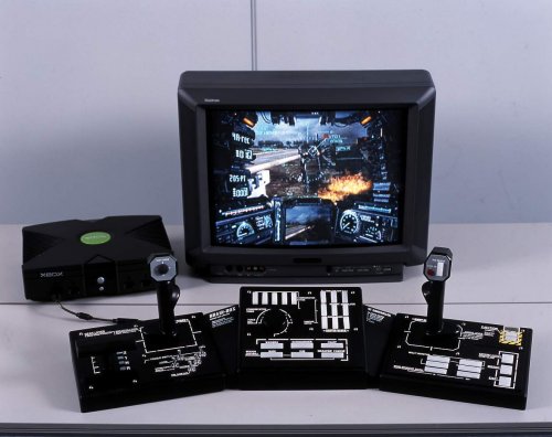
The Guitar Hero guitar or a steering wheel are good examples of mapping your interface to what’s going on in the game; so is the Steel Battalion controller. However, arrow keys and control pads also routinely achieve this.

In Mario 64, you push the stick in the direction you want Mario to move. In Katamari Damacy each thumbstick is one of your hands, pushing or pulling the katamari. In Skate the thumbsticks become a gestural interface, each movement corresponding to part of a trick. In Smash Bros., slamming the thumbstick violently to one side is a component of especially violent actions. In Metal Gear Solid 3, grabbing a human shield turns into snapping their neck if you apply a bit more pressure to the button. In Forza, the joypad’s right trigger becomes a pressure-responsive accelerator pedal. In Call of Duty it becomes the trigger of a gun.
This is why 3rd person action games have all adopted over-the-shoulder or camera-relative controls, rather than tank controls as in older games like Alone In The Dark or Little Big Adventure. It’s a big part of why FPSes have moved away from the “forwards/back/turn left/turn right” arrow key configuration of Doom, and why 2D games on PC often support the Up arrow as “Jump”.
More subtly, it’s how games (and specific weapons within games) can feel better without autofire. The effect may be the same but without autofire, every attack is something you’ve personally triggered – so the consequences will always feel more directly tied to your input.
4 – On the edge of predictability.
If controls aren’t predictable, the game’s unplayable or mushy and random. If they’re too easily predictable, they’re easy to master; that means they’re no longer inherently interesting.
Engaging controls need to be predictable but get away from you slightly, requiring constant focus and attention and rewarding increasing mastery with increasing precision. This knife-edge balance can come from the timing of snappy, volatile response (Megaman or VVVVVV); the nuances of subtle, intricate motion (essential to racing sims); the unfolding layers of combo systems (Devil May Cry, Street Fighter); or more typically a blend of the above, sometimes all three (Mario 64). Either way, the gap between success and failure should be hard, clear, and stand on the limits of human capacity.
Finally:
5 – Context and surprise
Though controls should be predictable – pulling the trigger should always shoot – they should also ideally have enjoyable and possibly surprising consequences based on their current context. Your fist can punch many things, but each reacts differently. Your gun can shoot many things but some ping off, some explode and some fall over. Your Katamari can pick up different objects but each makes a different noise.

The tool remains the same but the situations they’re applied to change dramatically. If you can surprise and entertain players when they apply the controls in new contexts then they’ll look forward to experimenting with new possibilities.
Magicka is a great example here, but so is simply interacting with people in Psychonauts. So are the different songs and riffs in Guitar Hero.
Adventure games are generally huge on this. They have all these verbs and nouns and they want you to play around with them but there’s nothing intrinsically fun about pressing buttons and getting an “I can’t do that” non-response, so they shove comedy everywhere for you to find to get you motivated about exploring the possibilities. Psychonauts definitely has this mindset too, what with the developers’ adventure game heritage. There are loads of cool little interactions specially added just to make interacting with stuff feel fun and reactive.
Here’s a challenge: check out Super Mario Bros (NES) world 1-1 and count the interactions available. Including the secret block and the secret area you can descend into I count 20 different ways things respond when you jump into them, jump on them or simply move into them.
All of that from left, right and jump. That’s context.
Wrapping it up:
If your controls are responsive, have clear feedback, map intuitively, are on the edge of predictability, reward mastery and cause significant things to happen in an empowering way… you’re probably on the right track.
Conversely, “bad” controls in many of the above respects can be aesthetically valid (as in survival horror, or in the ending of Shadow of the Colossus). Entirely predictable controls serve cerebral games well, and unintuitive controls can open the way to interesting mechanics – or simply be hilarious in their own right (See: QWOP).


