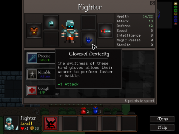
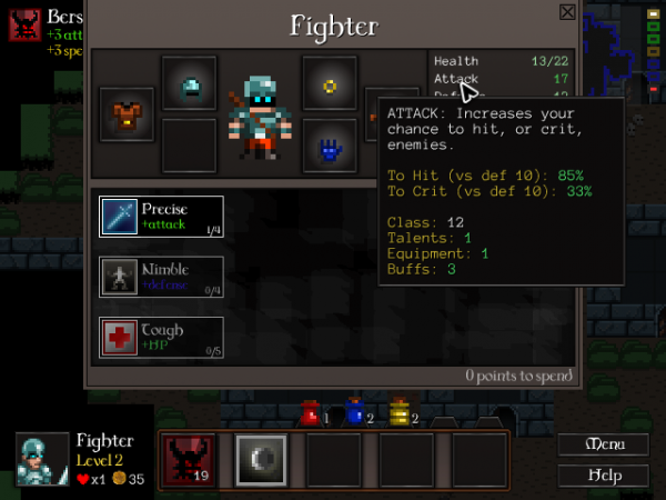
The Inventory screen’s finally gone entirely! Everything’s been merged into the Character screen now.
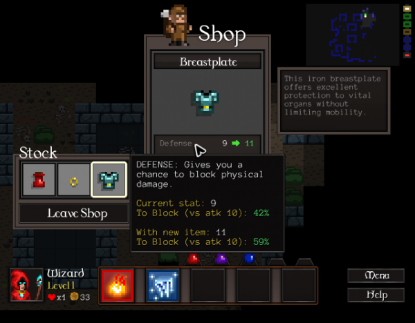
I’ve also been busy expanding popups everywhere with helpful information showing where stats come from and what they do.
It’s a pain trying to figure out what to show and what to leave out. I’ve settled on making it contextual: you get current and new stat effects when you’re making a decision which might change that stat, but if you just look into the character screen and mouseover your stats there you’ll see where the stats are coming from (adding up your base stats, boosts from items, etc). The most important thing, though, was settling on showing the effects of stats vs a typical low-level enemy. Instantly, you can put stuff in context.
“+2 defense? What the hell does that mean?” becomes “+2 defense increases my chance to block from 42% to 59%? TAKE MY MONEY”. It’s a big deal! I know how all the stats affect things – hell, I wrote enough about designing that system – and being presented with the numbers in game still makes stat boosts more compelling for me.
I’m still figuring out talent popups. They require a whole bunch of special cases to communicate everything clearly, from how Spell Damage boosts your fireball to how a talent might not be available for various reasons. Once I’ve figured that out I think I’ll be happy with the UI popups, though I’ll probably fiddle with the colours and formatting later.
The game’s UI is definitely more solid for all this. I reckon there’s at most a week or so left in UI and usability work before I run out and have to start working on gameplay and content again. 🙂


