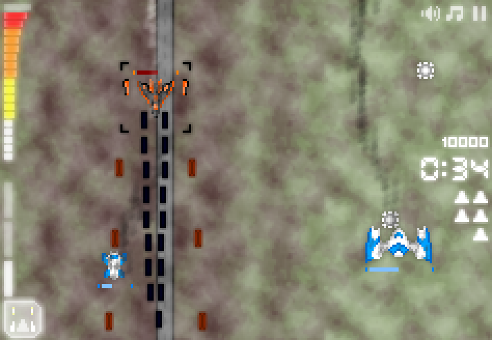
The most consistent feedback I’ve had about Fight Back is that it’s hard to tell when you’re about to die. I avoided putting a health bar in for as long as possible, relying on smoke, visible damage and the general ‘feel’ of having taken damage, but I’ve finally been experimenting with one today.
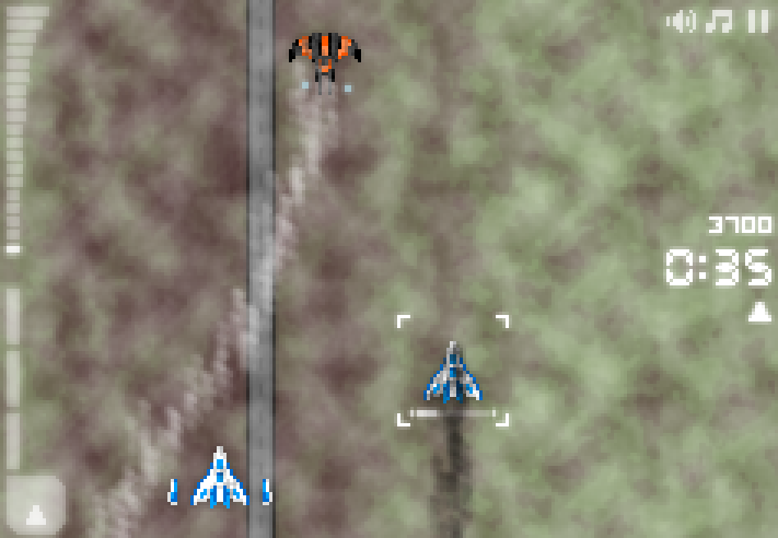
Here’s the first version I tried, with RTS-style health bars over everything.
Clutter city, am I right? And the health bars don’t really stand out, either.
Firstly, I realised there wasn’t much point to having health bars for all the ships; the important thing is knowing what your health is. Secondly, the appropriately-coloured health bars are bad. If the health bars have the same colour scheme as the ships instead of the UI, then they disappear into the scene.
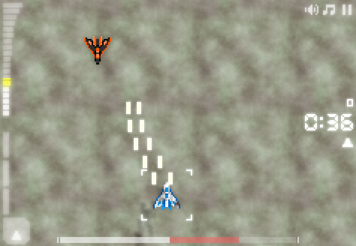
So I tried putting a health bar onto the UI.
This was a huge step up in clarity and appearance, but it felt horribly wrong in practice. The screenshot obviously doesn’t show it, but the rapid vertical motion of the playfield seemed at odds with a static, bold, horizontal line across the screen in the UI. It seemed to diminish the overall feeling of speed.
So, finally, I went back to the per-ship health bar idea, but only for the player ship.
I feel that strikes the right balance – it shows when you’ve got lots of health, and when you haven’t, and when your health’s low it flashes brightly to catch your attention.
I’ve been struggling with this relatively minor issue far too much. Hopefully now it’s done with!


