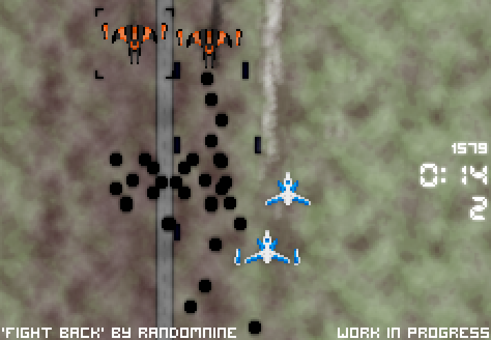
Fight Back has been monochrome for weeks. I got bored of this! MAKEOVER TIME.
OK, the backgrounds are still crappy and the UI is rubbish and incomplete, but the game’s way more visually attractive now and it’s much easier to see what’s going on. Result!
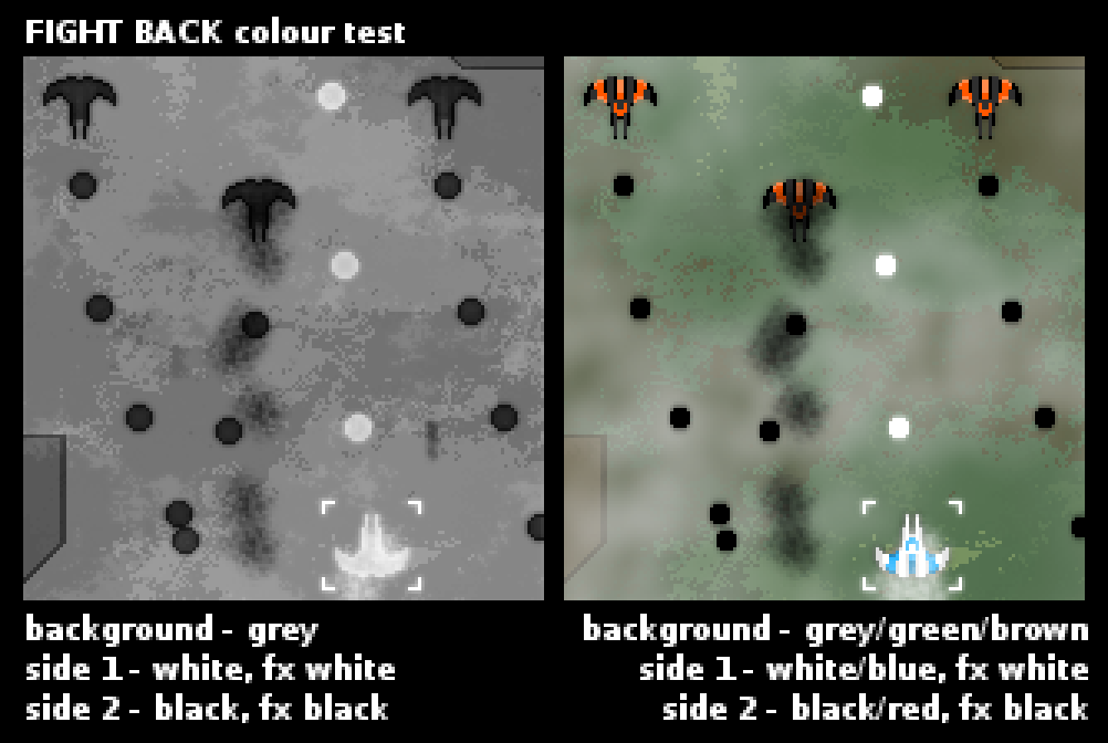
Here’s the concept mockup I did for the colour version, which shows the same scene with colours vs. black & white:
Instant improvement, right?
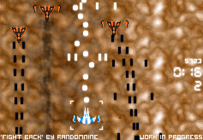
Taking screenshots of this game is hard as hell, since the screen’s constantly flashing black or white in some kind of attempt to induce epilepsy in the player, and when you take your hands off the controls then stuff tries to kill you. But I got a few more:
I probably need to change the background colour here so the orange ships show up more. It’s still a lot clearer than the black & white version, though.
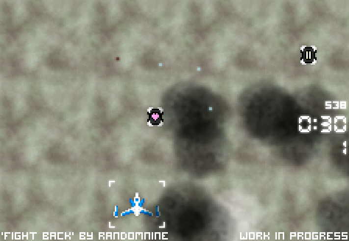
Here’s a shot of the new pickups. You used to magically get a life every 3 waves – I’m making that much clearer by putting an extra-life pickup in the play field every 3 waves instead. Later on, I’ll make it so this enters the play field in a dumb cargo ship instead of just floating into view.
I’m feeling much happier about the project now!
My plan for this week now is to overhaul the UI, making everything from time remaining to lives clearer and adding weapon level and heat indicators, and set up the intro tutorial. I’ll cut a new video once I’m happy with the UI. 🙂
As an aside, here’s a dance track I made over the weekend: serious unicorn business. I’m considering using it in Fight Back’s soundtrack.


