I’m getting rid of it, piece by piece. 🙂 I’m now handling item and spell management entirely with popup dialogs when you find stuff. Anything you don’t want will either be sold or left on the dungeon floor for you to revisit later.
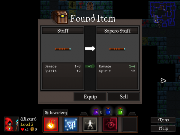
First up, that ‘Found Item’ dialog got a slight revamp once it went in game. The “Keep” button was confusing as heck; did it mean you were keeping the new item, or keeping the item it was under? So I moved the buttons around.
I also changed its behaviour to sell the unwanted item, because the levels were getting a bit cluttered with rubbish gear. Now you’re either equipping the item on the right or selling it. It’s not perfect – I’ll probably have to clarify that you currently have the item on the left equipped already and we’re looking at the one on the right – but it’s getting there.
Either way, you’re going to end up with one item equipped. The other one will be sold and destroyed.
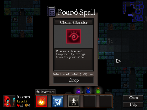
Spells require a different approach. You’ve got to chuck them into a spell slot. Rather than wiring up something so you could compare spells to each other, I just went with this:
Spells aren’t as simple as items; they have all these different unique effects. You might try spells out and then change your mind about them! Because of that, spells can’t be destroyed. Any spell you replace, or choose not to equip, will stay on the floor for later in case you change your mind.
When you find a spell on the floor, it’s going to start fully charged so you can cast it immediately and see how it works. This is all just about making things as transparent and self-explanatory as possible.
There’s now no reason whatsoever in the game to use the inventory. Next job is to look at merging the equipped items display from the Inventory screen into the Character screen somewhere. Then I can ditch the Inventory screen and its access button entirely!
That ought to be done by Monday. I’m looking forward to moving on from UI work and getting some more content in. 😀

