I had a go at merging the character and inventory screens. I think it’ll have to wait for now! I can do it, but I’ll have to rewrite the popup system so I can put item descriptions etc. into popups. So I started looking at a few other things instead.
CQ has some quite opaque mechanics. All the stats are pretty opaque, in fact! Attack, defense, speed and spirit all have non-obvious effects, and that’s a real killer when I’m trying to make them important. You can’t enjoy making choices unless you understand the relative merits of your options!
I’ve been experimenting with ways to clarify them:
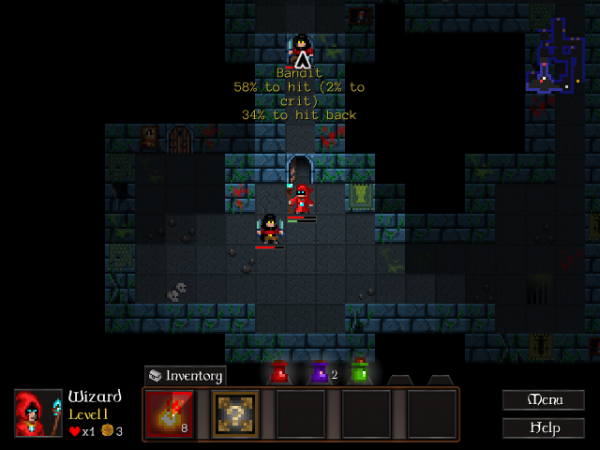
Mousing over an enemy will now give you your chances to hit and get hit. There’s a similar display for the chance a spell will fail that shows up while spellcasting.
Another little fix here is the recharge timer on spells – the fireball spell there taking 8 turns to recharge. That’ll hopefully be a further guide to the impact of Spirit, though it might be unnecessary. As for Speed, I have no idea. You’ll just have to judge that by enemy movement.
Spell recharging is a pain. What really complicates it is that Spirit makes recharging faster, but Speed makes it (subjectively) slower. Objectively speaking, spells take the same amount of game time to recharge – but your turns happen faster! It’s a hard problem to fix. I could have spells charge faster when your Speed stat increases, meaning they take the same number of turns… but that makes the Speed stat even more powerful.
It might be a necessary compromise for the sake of clarity. I could try balancing it that way – make Spirit more important, accept that the Speed stat is part of a magic-casting character build unless matched with a really low Spirit, and make Speed points rare and valuable.
Well, this project’s still in the early stages, so I have the flexibility to try out stuff like that. 🙂 I’ll give it a shot!
