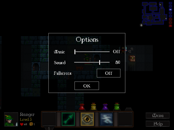
It’s still a mockup at this stage, but here’s the screen that’s going to replace those little buttons in the top-right corner of the menu. It’ll also give us volume sliders.
This transparent overlay will be shown over the main menu and over the game, whenever you go to the options screen. I’ve gone for a simple style that deliberately doesn’t mesh with the gameplay graphics, to clarify that it’s a non-gameplay menu… but I’d still like something more elaborate. I really need to find a UI artist to overhaul this game soon. 😀
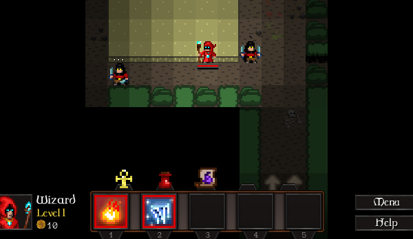
The other change lately is a subtle reorganisation of the skill/item bar:
Skills now have their corresponding hotkeys underneath. Items have been moved to be aligned above skill slots and are now used by pressing SHIFT+1 through SHIFT+5 instead of 6 through 0. I’m hoping this’ll prove a bit more natural.
The task list’s gradually getting shorter. 😀

