Jun 06 2011

MISSION HQ, INT.

Spam is amazing! “I like wootfu.com. Bookmarked for future reference. LEGAL STEROIDS”

Subtle. Anyway. OH GOD ART TAKES FOREVER

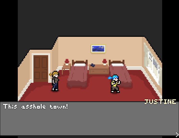
Above the dresser? That is Art. When you hear the buzzer, stare at the Art.

One thing I’ve found with pixelling that makes it totally unlike programming: distractions help me. It’s kind of funny – I always used to draw stuff when I was bored in school, to keep my brain awake enough I guess to half-absorb what was going on. Turns out the same’s true in reverse, more or less, and having something on in the background stops me getting bored while I’m drawing stuff for hours on end. Today’s E3 presentations have been filling this need nicely.

Course, there’s a downside. Today, I realised I’ve finally become a cynical old bugger who thinks mainstream games are rubbish. True, Microsoft and EA’s E3 presentations are always going to cover the most whitebread games available in the most shallow possible way, but I don’t think I saw anything new there I wanted to play.

That’s a little bit sad. Maybe I’ll rent Gears of War 3 once it’s out and just get drunk enough to enjoy it.
Jun 03 2011

INTRODUCTION. (ALSO: PLAGUE)

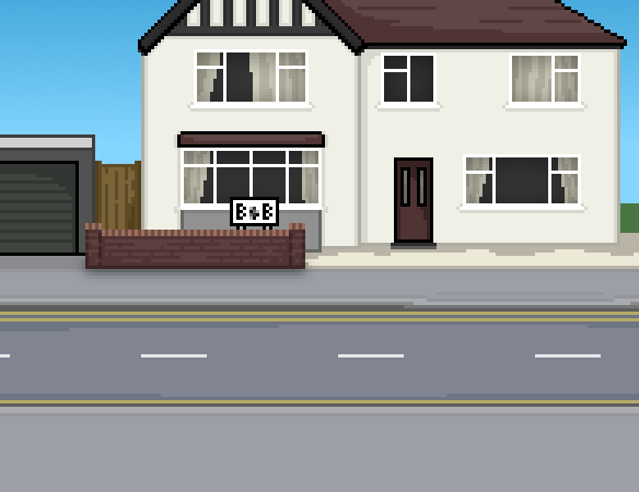
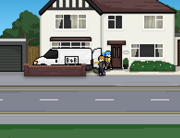
I’ve been waylaid by germs since Wednesday but I fought through the pain (at least this evening, with plenty of Lemsip) to finish the B&B exterior scene and code the full intro sequence.

I’m sort of happy with this scene now.

I am really looking forward to calling this done and getting on with something else. I think I’ve given up entirely on trying to predict when I’ll finish it due to massive, apparently unending scope creep, but it’ll be soon. SOON

And now I’m going back to bed.

Jun 01 2011

HQ

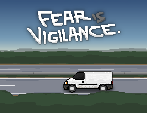
Well, the artwork from the last post is in the game now as a fancy scrolling-parallax title screen. I’ve been working on the remaining backdrops I need to be happy with the game, and I’ve hit a little trouble.

Drawing the van driving along gave me the idea of setting all the cutscene action and some intro/ending stuff in, or in front of, the bed and breakfast where they’re staying. The front of it’s maybe 80% done:

…and now I’m agonising over feeling like it looks a bit crap, and wanting to redo the park graphics to fix some issues there, and wondering whether I can simply move the cutscenes I’ve already got into these new backgrounds without changing the tone of the thing and having to re-script them and possibly redo their music. I’m basically struggling with art direction and the narrative flow of the cutscenes, whether it’s obvious how the locations link up and whether the transition from each to the next gives the right impression about the passage of time and movement through space.

But the main thing is that this backdrop’s mostly done. 🙂 I can probably finish it up and do the only other whole new backdrop, the room interior, tomorrow. Once all this stuff is actually in game, I can start making decisions about what I need to iterate on without worrying too much.

Vigilance has definitely taken on a life of its own. Fully realising it means tackling all these issues, which is stressful, because I’m out of my comfort zone 😀 but it’s great for the same reason. I think I’m going to feel much more confident in my pixel art when this is over!

May 30 2011

RURAL “A” ROAD. EARLY MORNING.

I’m starting to really enjoy this pixel stuff.

Here’s a panoramic version, and here’s the music that’ll go with this once it’s animated and in game.

This is the mostly-final artwork for the title screen, showing Marcy and Justine driving their van through the countryside in the wee hours of the morning. They’re quite dedicated.

I’m getting a bit worried that the fairly muted hues here will clash horribly with the brighter colours during the daytime scenes, but maybe it’ll work fine in practice! As for implementing this, I’ll need to break it up into multiple layers for parallax scrolling and make sure each of them loops well.

This is roughly half of the artwork remaining for Fear Is Vigilance, so I’ve got maybe a day more of pixelling and several days of programming ahead before it’s done. On with the week 😀

May 27 2011

WHEELS

I’ve had a busy day messing with cars, but I found some time and did some sprite work.

This is just a first pass for their van.

Vehicles are easy to do side-on (or top-down). There are blueprints online for just about any common vehicle you can think of. Pixelling them is just a matter of picking the important details, ditching the rest, and shading.

I did the whole thing inside a screenshot of Fear Is Vigilance with Marcy up front, just for colour and size reference and so I could see at a glance if it was fitting in. It’s most of the way there – the next step will be dirtying it up, because it’s wayyyy too shiny and new to be their van right now. Being well funded just doesn’t seem in character.

The perspective seems a bit awkward, but the van won’t be used in this scene. It’ll be used in driving cutscenes where the viewpoint is more obviously side-on. I’ll get them done over the weekend and through next week, and wrap the game up soon after 🙂

May 20 2011

TROUBLE IN THE FOREST

Today’s soundtrack:

Yep – I’ve been drawing trees! I think they came out quite well:

I’m currently debating whether to set up parallax layers so you get to see more of the city backdrop or whether to just leave it as is. “As is” is winning.

Yesterday’s work was far less dramatic. I set up a preloader, a pause screen when the game loses focus and the ability to mute the music. The reason this stuff took an entire day is the preloader! HaXe simply isn’t set up for it, and every single tutorial on the Internet no longer works with the current version. I’ll do a technical how-to on Monday.

What I haven’t done yet are the actual title and ending sequences, so there’re still a few days work to do on Vigilance before I’m ready to ship it. It’s a shame I won’t have it finished by the end of Ludum Dare judging, but that’s totally my fault. It won’t be long 😀

Once it’s done I’ll be starting my first search for sponsorship and a little income. I’m excited!

May 16 2011

TREES

Hate ’em. They’re jerks and they’re hard to draw, because they’re not made of boxes.

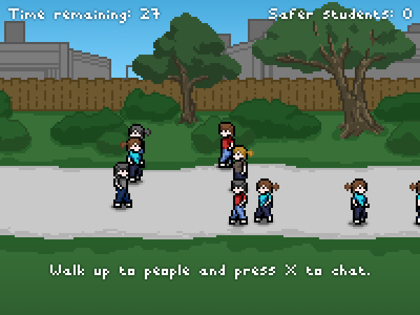
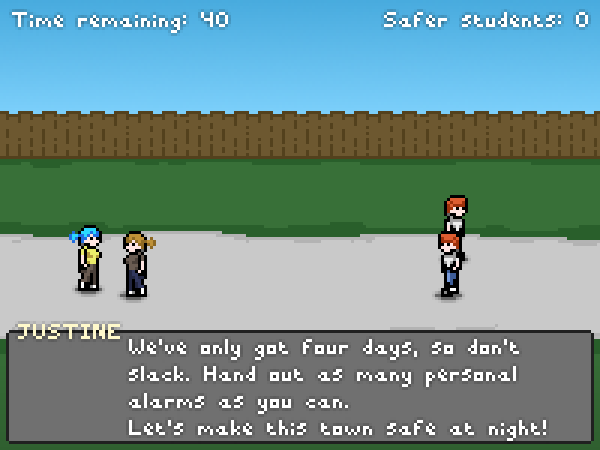
I’m spending this week on my latest Ludum Dare game, Vigilance. I’ve got tons to do, starting from “adding a pause button” and working up from there – but the first thing I wanted to sort out was the backgrounds. I’ve got the park background up to a reasonable-ish standard now…

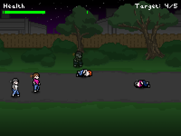
Instant improvement! But it’s still lacking the actual trees and bushes you’re meant to be able to hide in of a night time. I’ll get back to trees tomorrow.

Besides the backgrounds, I’ve made a bunch of bugfixes and minor tweaks, mostly to the character AI and chat boxes. For the rest of the week, I’ve probably got 3 days work to do on essentials like a preloader, intro, decent ending, pause button and so on to make it feel like a complete game.  Here’s hoping I have time for actual gameplay changes!

May 13 2011

GET TO THE CHOPPER

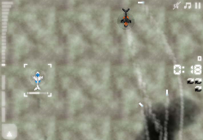
Homing attacks are proceeding acceptably. Here is the first ship from Sector 2 in action:

That’s the new attack helicopter. Its secondary attack is deploying those homing missiles. The missiles can be shot down, but they’re fast! It’s perhaps easier just to dodge them until they run out of fuel and tumble off screen.

It’s a neat weapon. I am looking forward to making some kind of boss which periodically unleashes a vast missile Armageddon.

Continue reading »

May 12 2011

MISSILE

Spent Wednesday hanging out with Hanzonaut, talking concepts, getting drunk, playing Test Drive Unlimited 2. Good times. So this update’s a day late and a bit light.

Random good news – Vigilance won Bytejacker’s Free Indie Rapid Fire this week! It was a shootout between three Ludum Dare games and my game was selected and took it home with 65% of the votes. Pretty awesome! More incentive to spend next week polishing this game up and find it a permanent home on the internet.

Back to FIGHT BACK! I haven’t implemented anything for the new stages yet but I’ve spent the time brainstorming and I have pretty solid concepts in mind now. Sector 2 will be about homing attacks, suicide ships, and giant frickin’ lasers. Sector 3 will be about EPIC THINGS IN SPACE, like asteroid fields, warpgates, floating weapons platforms with turrets on, and battleships which span multiple waves. Sector 4 will be about… well, I’m not sure yet, but I want to work in ships that arrive on screen in a chrysalis that takes 5-10 seconds to ‘hatch’. I might work in semi-organic ships at some point. The concept for sector 4 is just to mash everything so far together with a few new boss ships. That might not be enough… but we’ll see.

Pickup-wise, I’m planning to add a homing missiles pickup in sector 2 and an aimable turret in sector 3 which you’ll be able to fire around at random angles. I think that ought to be a decent mix.

May 09 2011

MAKING WAVES

Well, I’ve fixed the new ship type.

  • Instead of moving forwards and firing sideways, it hangs around like anything else and constantly shoots diagonally in a shallow V.
  • It’s now fast but it accelerates slowly, taking time to build up speed, and taking time to stop again after a motion. That makes it feel ‘heavy’ and be slow to react, but it’s still capable of crossing the playfield quickly.

Amusingly enough this makes it more like a ‘heavy’ fighter in Street Fighter/DoA etc., ie. Fight Back’s inspiration, rather than a ‘heavy’ ship in a traditional vertical shmup. I tried to bring in some shmup inspiration and ended up coming back to fighting games for ideas – I guess though Fight Back’s a shmup in presentation it’s a fighter in feel, and minor elements you’d expect from fighters feel more comfortable.

With those tweaks it serves the same purpose – cutting the play space up – but it can get to things quickly and be awesome to play as, just like any other ship. I think I’m happy with this kind of heavy ship now.

Next up is figuring out sectors two through four! With that in mind I’ve been redoing how the ships are set up for each wave.

Continue reading »