Apr 27 2012

ARCHERY

I’ve added some real jerk AI.

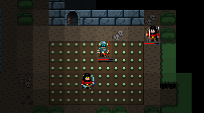
That guy on the right is an archer. He’s slow but he runs away from you, staying at range and slinging arrows every half dozen turns or so. You don’t want to run across an open field or fight through melee enemies to get to a couple archers – you won’t make it! You’ll have to use the terrain or flank ’em.

This kind of enemy – something weak  that runs away from close combat and is  dangerous from a distance – is one of the ways I’m hoping to round out the tactical challenges in CQ2. I’ll be using the same model for enemy spellcasters: enemies who hang out at the back and debuff you or buff and heal their allies. Finally I want to mix in some tough, really challenging enemies every now and then who need to be taken on very carefully.

The other major thing I’ve done this week is move my task list into FogBugz, so once I’ve established my velocity over the next few weeks I’ll be able to start showing off burn down charts and predicting a rough release date. For now, at least I’m enjoying racing my estimates. 😀

Apr 20 2012

SAVING THROW

Since Monday I’ve been doing some general bugfixing and busywork, but on Thursday I got bored of Cardinal Quest II development and went back to the first game to do something that’s been long overdue:

Cardinal Quest I now has a save game system, ready for the phone versions. This’ll go out in an update for desktop users sometime in the next month or so, to tide you over while the sequel’s in development. 😀

And now I’m getting ready for Ludum Dare. About a thousand games are going to get made this weekend; I’m doing mine with Flixel for a change. See you on the other side…

Apr 16 2012

SKILL CLASS

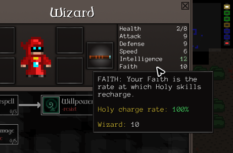
With the consumable changes out of the way, I’ve gone on to fiddle with the skill system a bit. I’ve taken a little inspiration from Dark Souls and added a second spellcasting stat, Faith. Magic users now have to be concerned with both Faith and Intelligence.

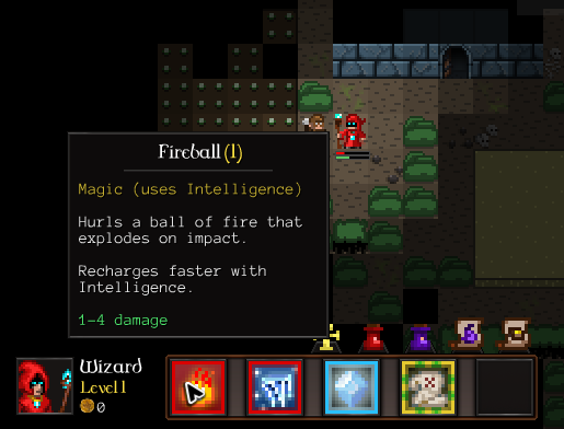
I’ve colour-coded all the skills in the game to fit into one of three categories.

  • Magic skills have a red border, recharge based on Intelligence and can be instantly recharged with Mana Potions
  • Holy skills have a light blue border, recharge based on Faith and can be instantly recharged with Offerings
  • Physical skills have a green and gold border and recharge when they feel like it. They aren’t influenced by stats or consumables, so they’re good for characters with low magic stats.

It’s a bit ugly because I’ve just jammed those borders in without adjusting the art, but it gets the point across. 😛

Magic skills include damage-dealing stuff (Fireball), debuffs, unit control (Charm, Polymorph) and teleporting. Holy skills include buffs for yourself, crowd control (Fear, Sleep) and healing. There are only a handful of Physical skills at the moment, but I’m planning to expand that with a broad range of minor or utility skills.

The system adds another dimension of character customisation, asking you to work with the items and skills you find to pick stuff that works together. If you find mostly Magic skills, you’ll have to emphasise Intelligence. Find Holy skills and you’ll have to emphasise Faith. Find a mix and you’ll have to pick which is more important to the playstyle you’re developing with that character.

I’m feeling pretty good about the core systems now! It might be hard to believe, but the recent changes – especially consumables – have made a huge difference to how the game feels. One playtester today had a go and, afterwards, didn’t believe they’d been playing for over an hour. It’s become a much fuller and more diverse game almost overnight; I can’t wait to start rounding things out with more content. 😀

Apr 13 2012

DON’T PANIC

A “panic button”, in game terms, is a skill/item you reserve for emergencies that makes the emergency go away.

I’ve been overhauling the consumables system and I think I’ve settled on something that works. You can hold, at most, five consumables. They don’t stack. There are currently 16 different consumables and I have plans for more. And a lot of them are panic buttons of various kinds.

Like this:

Or this:

“Summon Elemental” gives you a friendly level 6 elemental who will happily cut through a dozen bandits.

Both of the above are actually starting items for those classes right now. They’re incredibly overpowered – but they’re single-use items, so it’s okay! Temporary overpowered stuff is awesome; it makes you feel like a badass, but you still need to fight through most of the game without it.

Meanwhile you’ve got a belt limit of five consumables and you’ll find more on every level. And some, like the Summon Elemental scroll, are strongest early on in the game. So… you’d better use ’em up.

The consumable on the left in both of those shots is the Ankh. That’s a special item that resurrects you when you die. Everyone gets one to start with, rather than the life you start with in CQ1. Unlike that life, it’s inconveniently taking up one of your precious consumable slots. I’m considering doing something fun with it in a Dark Souls kind of way where you can, instead of saving it, choose to use it straight away to increase your maximum hit points by 2 and play on without a safety net.

All told this feels way tighter than the old system, plus the consumables can be way more powerful and diverse. I’m looking forward to dropping a few super-rare items in which do some really cool stuff, if you’re lucky enough to find them. 🙂

Apr 11 2012

POTIONS

I’m back from Easter!

I should have put up an “away for Easter” post, huh. NEVER MIND. I’m back, and I’m trying to figure out potions. I don’t like how they work, but I haven’t settled on how to update the system yet.

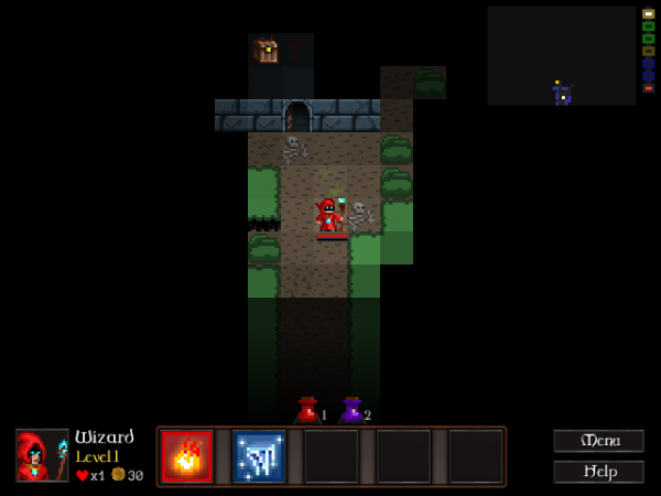
First possible solution was to cut the potion types down to two: health potions and mana potions. You’d only have two slots, and only ever find those two kinds.

They look so lonely!

That’s one solution, but it feels really basic. What I think I’m going to try next is a system where you can find different potions, scrolls, possibly wands and so on… but they don’t stack. So there’ll be less of a focus on health potions, and you might find some really weird single use stuff.

The game’s skills largely fall into one of three categories; either they’re things you do to prepare for battle (buffs like Berserk or debuffs like Freeze), things you do routinely in battle (like Fireball or Uppercut) or ways to handle emergencies (Heal, Teleport, Charm Monster). Most of the old potions had effects which fell into the first category – temporary boosts to stats which would be good to apply before a tough fight. I’m going to try to switch over almost entirely to consumable items which fall into the last category: stuff that saves your skin when you’re in trouble and all your skills are depleted, but in excitingly different ways. Here goes!

Apr 03 2012

APOCALYPSE DOG

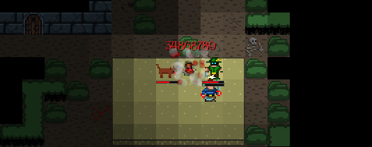
Accidentally introduced a bug today that gave the dog apocalyptically gigantic damage.

Oops.

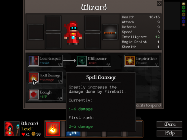
Besides that, I’m pretty much done with the popup work. One last popups shot, featuring the talent tree popups:

Okay, this stuff isn’t very glamorous – but it makes all the difference when someone new to the game enjoys themselves and happily clears the first level within a few minutes instead of going “huh?” a lot and not really engaging with major systems. The game makes sense now, without any introductions or explanations. That’s huge. 😀

A little more usability work and bugfixing over the next few days, then it’s onto new stuff – like enemy variation, full talent trees for all the classes and some kind of boss fight.

Mar 30 2012

MORE POPUPS

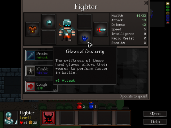
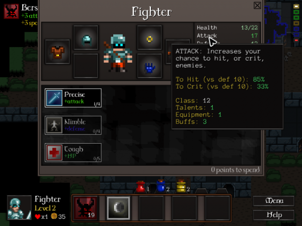
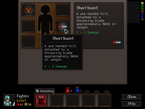
The Inventory screen’s finally gone entirely! Everything’s been merged into the Character screen now.

I’ve also been busy expanding popups everywhere with helpful information showing where stats come from and what they do.

Continue reading »

Mar 27 2012

POPUPS

Fixed ’em.

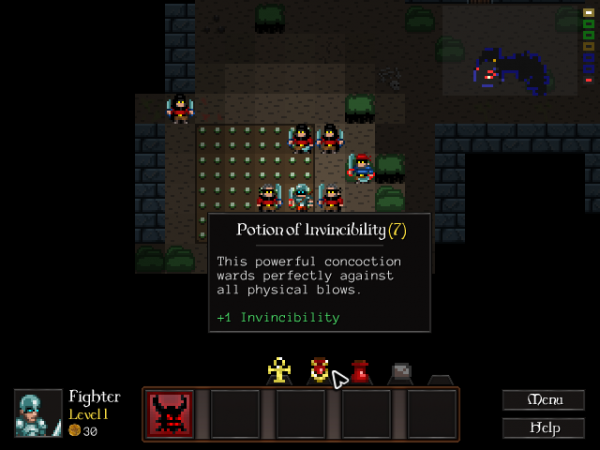
I wanted to get a whole lot more information in there, have them be prettier and more readable and feel more solid. I think this is maybe 60% of the way there. I’ve drawn some inspiration from Diablo 3, which has huge chunky popups that tell you everything; I haven’t gone quite as crazy as they did, though. There’s only so much you can do in 640×480.

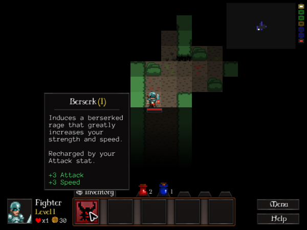
I’ve started taking information that shows up in various panes in the current UI and moving it into popups:

It’ll now show you what potions and spells do (see the first shot) without you having to open the Inventory screen. More importantly, this’ll let me drop what’s left of the Inventory screen – those six equipment boxes – into the Character screen and get rid of the Inventory button altogether. Here’s to a cleaner, more informative UI. 😀

Mar 17 2012

SHOPS, STATUS & SHRUBBERY

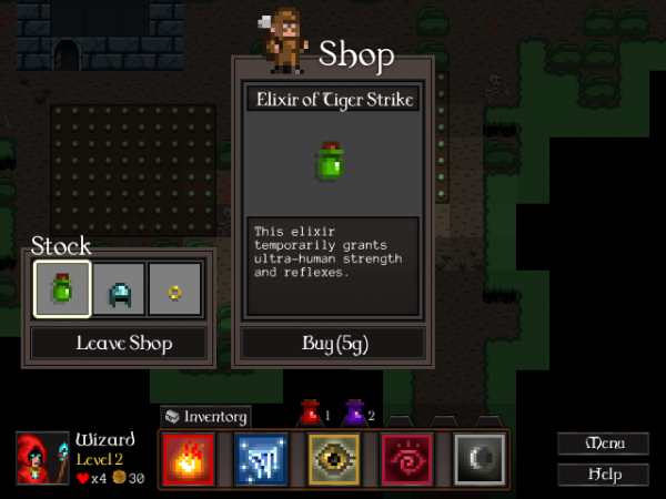
SHOPS are now in! You can buy stuff from scavengers. CQ2’s got a rudimentary economy, which will grow a bit shortly when I add gold stashes to loot drops, give you a gold bonus if you rush through a level instead of exploring it fully, and (possibly) allow you to carry gold over between runs like in Desktop Dungeons.

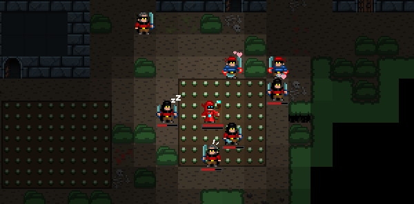
STATUS: Enemies now show little icons when they’re afraid, charmed or asleep. This is part of a whole battery of changes to combat – I’ve also been tweaking combat, delaying enemy actions, adding “block” animations and so on to make what’s going on in fights much clearer.

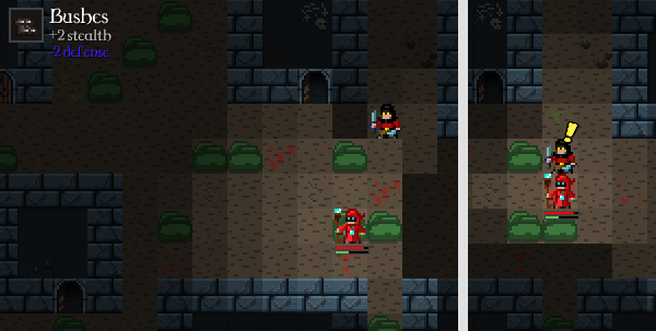
Last of all, I’ve just added the first terrain buff: bushes give you a Stealth buff so you can sneak up on people through them.

I’ve also been optimising enemy movement and plugging away at usability fixes. It’s been a productive few days and the game’s starting to feel much more playable. 😀

A few more major tasks and I’ll have finished my second milestone out of four on CQ2… then I’m on to adding an absolute ton of content!

Mar 14 2012

ROUGH EDGES

I’ve recently been getting pretty sick lately of having a mess of an almost-game on my hands while I rummage around in its internals, fixing things and rewiring others. Since the last update I’ve focused on getting everything into a coherent (if crap) playable state – story, music, combat balance, shops, etc – just so I can finally get it in front of some people and start getting some feedback.

For example, with introductory plot and level entrance paths, town/forest levels now start a bit like this:
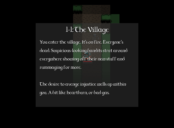
See? Crap but functional. Everything’s there (the UI slides in after), even if some of the stuff in the game is a bit wonky or placeholder. That copy’s not final, for example… the game’s going to have a slightly more serious tone!

Yesterday at Cambridge Indies CQ2 got its first real playtest, a quick runthrough by dock that gave me a ton of motivation and about a dozen things to fix. I’m now fixing all that stuff and similar things as they occur to me, so instead of my recent work featuring bold new systems and dialogs, my change log now looks like this:

The “Level up” notification was the main point of feedback. When you level up in CQ2 you get a talent point you can spend to increase your stats, learn a new spell or upgrade an existing spell. You have to go to the character screen to spend that talent point, but  no-one was realising a) you got points to spend or b) that they’d just levelled up. Hell, I was missing it myself! There was a notification, but it was just a little glowy thing down in the corner.

I FIXED IT
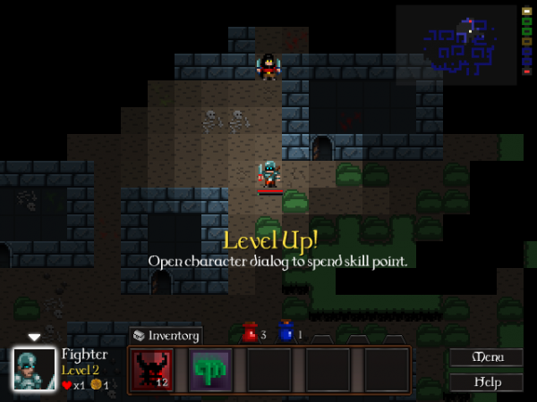
It did not need to be SUBTLE.

I’m not doing much that shows up in screenshots right now. What I’m mostly doing, based on feedback and watching a few people play it briefly, is making every part of it a little tighter, clearer and smarter. The mouse behaves better. Confusing or awkward things are laid out more nicely. Things you should notice are getting more obvious or working more like you’d expect.

It’s getting more solid. Yeah, this is ‘polish’. I’d normally put it off to the end, but smoothing out these rough edges is making the game more immediately fun – and a fun game’s much more fun to work on. So here’s to polish… and to playtesting. 😀