The first thing I’ll do when starting a new game is to scribble down notes and ideas. Maybe I’ll draw little diagrams of how stuff works, but in general it’s just about getting how the game works down on paper. I have dozens of little text files full of notes for projects I’ll probably never get round to.
The second thing I do is work a visual mockup – a fake screenshot – and design the interface.
Now, everything about a game is interface. In a platformer, foreground and background elements have to effectively communicate which is which. In Beacon, foregrounds were white and red and backgrounds were grey and purple. There were the large structures which used white, but that worked because their scale (and often parallax) implied distance. The character has to stand out. Everything has to be at a good scale, so I can present a few obstacles to the player at a time without them getting distracted by stuff miles away. The camera has to be close enough that there’s visual drama – if everything looks distant, it’ll feel distant.
The user interface has to be minimal, clear and effective in peripheral vision. If I want to embed any UI-type information into the game world, I need to work that out. These are the issues I tackle with the visual mockup.
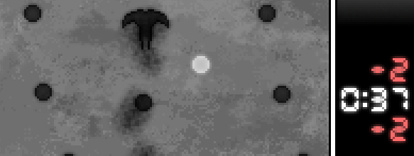
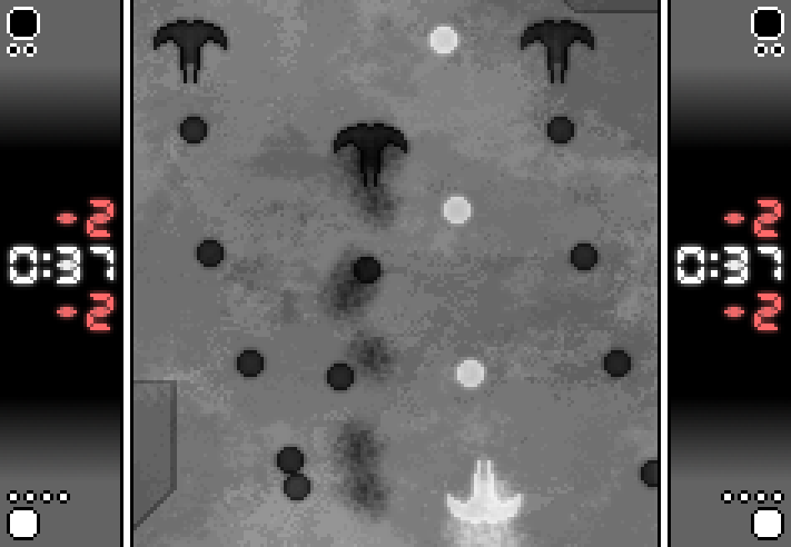
Here’s the concept I’m working on at the moment – click through for a full res version:
It’s a shmup with a twist. The main problems I wanted to attack with the visual mockup were:
- Can I make it look good without spending long on visuals?
- A lot of (non bullet hell) shmups look boring. Can I at least make it look like something’s happening?
- What kind of scale do I want for the ships and the playing field?
The answer I’ve come up with is to zoom in much closer than the typical shmup, so you’ll be in constant close 1-on-1 (or 1-on-3) encounters with moderately dangerous enemies. I’m fairly happy with the look now, though it’ll be much more apparent what I’m doing with the cloud layers when you see it in motion. 🙂
The interface is duplicated for the sake of aesthetics (and making stuff really intrude on your peripheral vision, since it’s going to be quite an intense game).
The visual mockup is a throwaway thing, so it doesn’t have to be perfect if I find answers to the problems I’m working on. For example, the background in that shot looks crap because ultimately I cropped away 3/4 of the original – I wanted to zoom in on just the essential action.
Using Flash makes for a few compromises. The main ones are that I can’t fade stuff in and out and I’m severely fillrate limited. That’s why this is running at 3x pixel zoom with borders: the native res of the playspace in that shot above is a mere 157×164, which should let me overlay a bunch of effects and a lot of chaos without any slowdown. I don’t know how much I can really get away with so I’m starting small.

