Of all the various aspects of game design, UI has to be the one that comes closest to design proper. Functionality’s a given – what you’re concerned with is making that functionality logical, clear and a pleasure to use, so even complicated things feel simple.
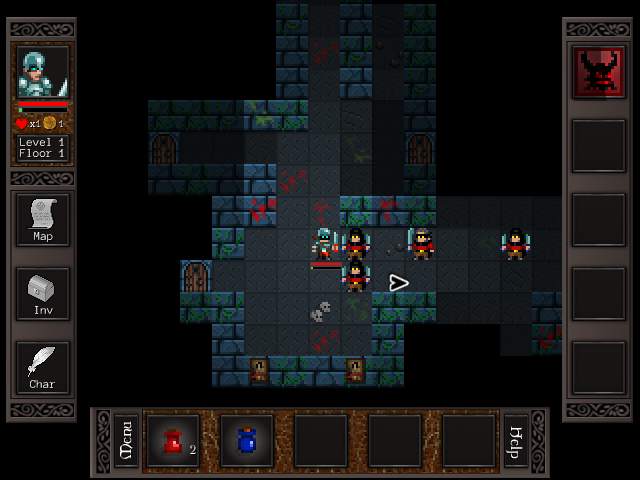
Cardinal Quest’s interface had everything it needed, but it kinda dominated the screen.
(All these images are resized slightly – click through for the correct resolution.)
It’s an effective UI and it shows you everything you can do, but it wasn’t necessarily that efficient with screen real estate and it could feel a bit overwhelming the first time you brought it up.
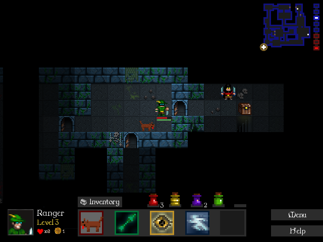
Here’s the rough draft of the new UI for CQ2 – essentially a quick attempt to see how everything will be laid out, how it’ll work over the game graphics and whether everything will be spaced and arranged nicely.
Here are the principles that guided this UI redesign:
- The arrangement of the spells and potions should match the spatial arrangement of the hotkeys you use to trigger them (1-5 and 6-0). CQ specific? Sure, but it’s important! This was the main drive behind moving the spell bar from the side to the bottom.
- Increase functionality; reduce waste. That map display in the corner? With a little “expand” icon, this replaces both the old map button and the floor indicator, uses up about as much of the screen and provides way more information. It’s also transparent, so it obscures less of the screen than it should.
- More important or commonly used features should be larger or more prominent. The spell bar’s the most important thing, so it’s huge and central. Potions, submenus, your level and so on are secondary.
- Things which are related to each other should be close spatially. The inventory button’s now down with the equipped items, because it relates to them. Everything map related (the map button, the floor indicator) has been pulled together. The Menu and Help buttons are tucked away in a corner.
- Keep it clean. Empty space for the game to shine through is really valuable; don’t eat into it without a really good reason. Part of that is eliminating redundancy. The Character menu, you now bring up by clicking on the character portrait (and this will be made clear as you play!). The health and experience bars from under the portrait are also gone, but you’ve always had the bars under your character.
Several hours of fiddling around with screenshots and I had that rough version above. It’s a process of constant tweaking – every time you step back and move something a couple pixels, it gets better.
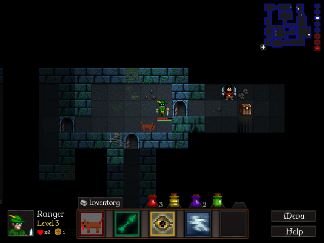
A few more hours today (hey, I’m no artist!) and I had this:
My games tend to have minimalistic UIs, so an interface with this much going on is new to me. Still, I think it’s come out OK. 😀 We’ll likely get an artist in to make it shinier later, but this’ll do for development.
I’m modifying the old UI code to implement the new design now. All told this UI overhaul will have taken me around a week’s work, but compare it to CQ 1’s UI and I think the further development is time well spent 🙂
That said… the space between the spell bar and Menu/Help buttons is looking a bit cramped. Maybe I’ll make them narrower…


