Aug 02 2012

CONTROLS

It’s theory time again! Inspired by a TIGSource forum post, I’ve been thinking about the question: how do you make your game’s controls fun?

See, not every game needs tight, fun controls. Sometimes they can be destructive to the experience you’re creating. Sometimes you’re after deeper gameplay which conflicts with the simplicity and immediacy of great controls.

But most of the time, we want pressing buttons to feel awesome – and there’s a good few ways I can think of to achieve that 🙂

Starting with the basics:
Continue reading »

Jul 27 2012

FIGHTER

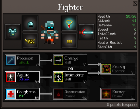
The Fighter’s the first class to get a full set of talents. Complete with programmer art. Lucky fellow!

Now he’s got a whole bunch of skills which let him take damage better, and he’s got a choice between Charge – which is great for hunting down ranged enemies and pulling off sneak attacks – or Intimidate, which is better at handling tough enemies and packs.

As you level up a Fighter you now have a major choice between two new skills: Charge, which allows you to dash across and hit an enemy from several squares away, and Intimidate, which weakens and occasionally scares enemies near you.

Continue reading »

Jul 15 2012

ENVIRONMENTS

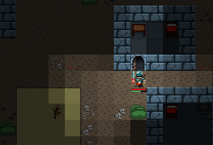
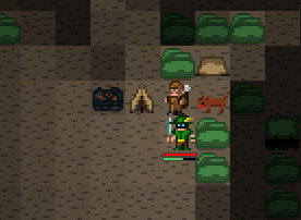
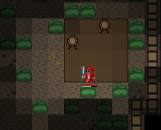
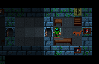
The art’s still very much placeholder, but I’ve been expanding the systems to handle more interesting level features.

Like furniture in a house in the starting village, or a scarecrow in the field.

A camp on the edge of a clearing in the forest.

An archery range to one side of a fortified hostile town.

A bare storage room within the keep.

I now have just five “must fix” tasks left before I’ll be happy to really start showing the game to people, I think!

Jun 21 2012

PREVIEW

Development’s been a bit heavy lately. The first major milestone’s coming up soon and I’ve been hammering away on some big, nasty tasks to try and get that done. The latest was porting the save system across from CQ1. Now, save systems that can save the game anywhere (not just at checkpoints) need to dig into just about everything in the game, so implementing one means methodically going over just about every gameplay feature and bit of game state in fine detail to make sure nothing’s been missed.

It was a right pain! That was about two days’ work, filling out multiple notepad pages to make sure I didn’t miss anything. Now it’s done, but I’ve got another dozen or so tasks around that size to get done for the milestone. I’m starting to wish I’d set up a simpler milestone before this one 🙂

Anyway, what with focusing so much on development, I haven’t had as much time for this blog as I’d like. Fortunately there’s material popping up about CQ2 elsewhere! Gerrard Winter did a cool double feature on CQ2 for Indie Games Mag covering where it’s at and where it’s headed. Check it out.

Jun 12 2012

INVADERS

Cardinal Quest 1 is out now on iOS and Android. 😀

Since the last post I went to the International Roguelike Development Conference 2012, picked up some cool ideas, demoed the game to various people… and fell horribly ill with some sort of bug, which knocked me out for the rest of the week. I’ve still got the traces of it – I’ve got a nasty cough and my throat’s all messed up. I’ve been working on my Solid Snake impression.

So I’m back at work now and trying to figure out what the hell an end-of-chapter boss should look like in a turn-based roguelike. o_o

May 31 2012

IN THE STUDIO

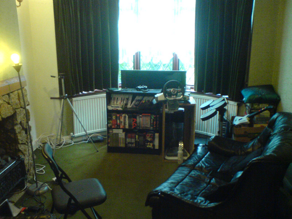
The past few days have been a holiday of sorts from CQ2 development. Ido came over for IRDC and has been hanging out with me here in the office. We’ve been working on Cardinal Quest 1 instead! We’ve been getting version 1.3, the save game update, ready… that and playing around with Joshua’s Android build, which is neat as heck.

It’s adorable! It works really well on a tablet; surprisingly so.

Today’s job was a different mission. Moving furniture, switching on as many lights as possible and setting up a little film studio in the living room:

…all in the service of something quite neat we’ll be doing soon, even if – by this point – it’s a bit predictable. 😀

May 25 2012

OPTIONAL

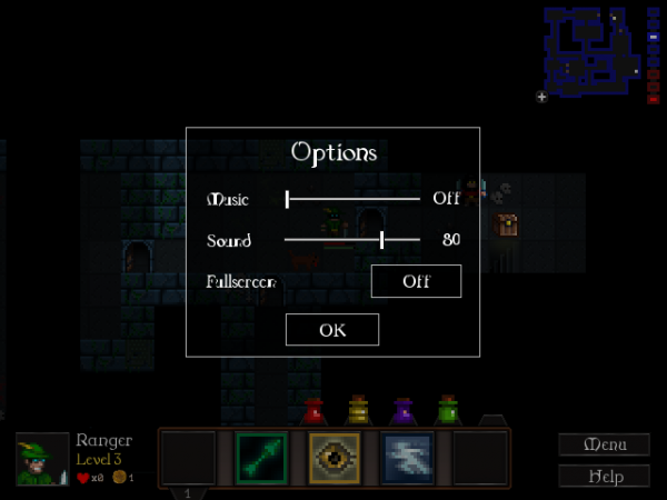
It’s still a mockup at this stage, but here’s the screen that’s going to replace those little buttons in the top-right corner of the menu. It’ll also give us volume sliders.

This transparent overlay will be shown over the main menu and over the game, whenever you go to the options screen. I’ve gone for a simple style that deliberately doesn’t mesh with the gameplay graphics, to clarify that it’s a non-gameplay menu… but I’d still like something more elaborate. I really need to find a UI artist to overhaul this game soon. 😀

The other change lately is a subtle reorganisation of the skill/item bar:

Skills now have their corresponding hotkeys underneath. Items have been moved to be aligned above skill slots and are now used by pressing SHIFT+1 through SHIFT+5 instead of 6 through 0. I’m hoping this’ll prove a bit more natural.

The task list’s gradually getting shorter. 😀

May 22 2012

UP FRONT

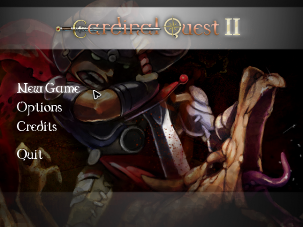
New main menu!

It’s a good deal cleaner and shinier. The background’s subtly animated; I’ve spent the best part of today adding in a handful of effects that make this screen nicer.

The rest of the day went on proper widescreen support. CQ2 now adapts to your monitor’s aspect ratio in full-screen, supporting up to 16:9. The only part of the game that now doesn’t handle widescreen properly… is the new menu 🙂

I’ll be patching that up tomorrow, revising the new assets for the 854×480 widescreen resolution. Then it’s on with a minor GUI overhaul: I’ll be adding a “Rest” button and putting numbers by all the hotkeyed skills/items.

And eventually my velocity will stabilise in FogBugz and I’ll have a decent idea when this game might be done. o__o

May 02 2012

HINTS, BLOOD AND ARROWS

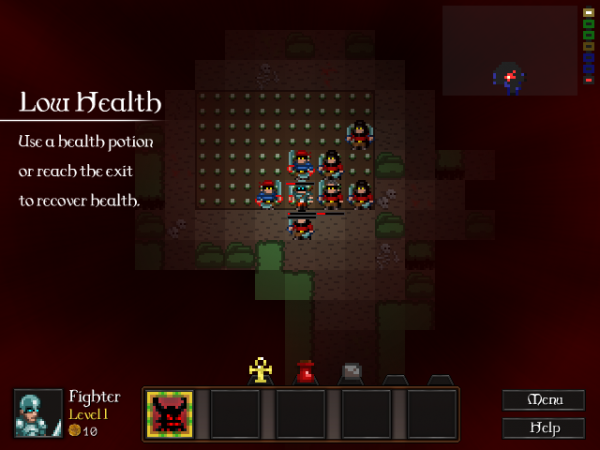
Oh, Fighter. You are in TROUBLE.

(Click through for the sharp, full-resolution version.)

It wasn’t feeling quite dramatic or obvious enough when you were on low health, but you know what? I think I’ve fixed it. 😀

The text on the left is the explanatory tutorial blurb for the first time you get knocked down to dangerously low health. There are four or so little tutorial hints like this, explaining movement, items, skills and so on. You’ll only see them the first time you play the game (if that), but I think they’ll help explain a few major systems people don’t tend to get immediately at the moment.

As for arrows, I’ve just added a proper effect in for them to complement all the archery in the game.

pew pew!

Now I’m off to play Dark Souls some more and see if I can finish it. Getting a lot done during the day is great and all, but I sure as heck don’t want to spend my evening sitting at the PC after 🙂

Apr 30 2012

AREA CLEARED

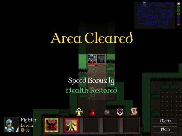
Here’s something I’m trying out:

It might be a bit artificial but it communicates two key mechanics: you get healed when you move to the next area, and you’re rewarded with gold for getting there fast.

I’m now working methodically towards the goal of getting to a solid alpha version with all of the main gameplay in, from starting the game up to a big ol’ boss fight, hence this essential, structural stuff. Next I’m going to set up a tutorial to guide people around the game properly, bit by bit – so that’s movement, combat, using spells and using items. These are the highest priority items on my to-do list, so down they go 😀

When I reach the end of that list – and there’s another 36 items on there, plus no doubt a few extra will clamber on – it’ll be time to really start letting people see what CQ2 is about. It’s too early to tell when that’ll be yet, but I’ll keep you posted!