Feb 01 2012

EQUIP? – ROUND TWO

Since the game was starting to come together okay, I put a version out to a few people for testing yesterday.

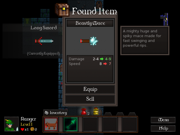
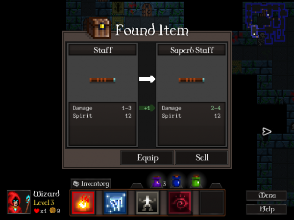
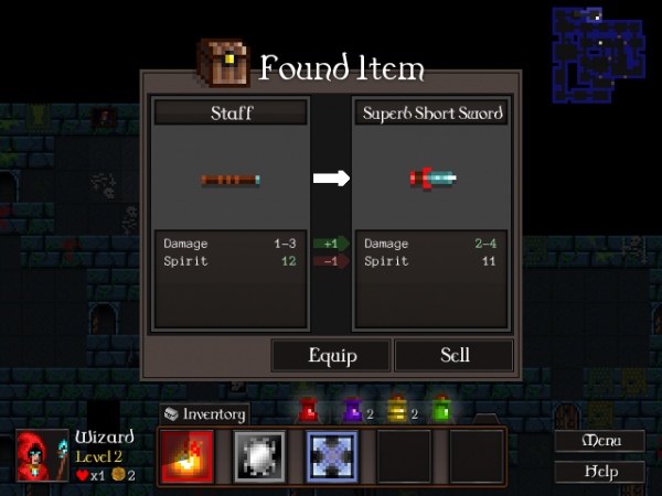
The main thing this found was a whole bunch of bugs – I broke mouse control entirely! However, another common point of feedback was that the Found Item dialog was confusing and a bit rubbish, like it not being obvious at a glance which is the new item and which is the old one.

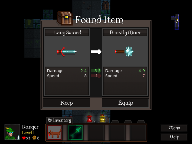
All the clues are there – sort of – but it’s still something that took a while to interpret, and this is stuff you need to be able to parse in a split second. I’ve been revising it today and it’s now leaner and clearer:

It’s a pain in the arse redoing work you thought was done, but hey! If it’s broke, it needs to be fixed. Hopefully this version will playtest better or I might have to reconsider removing the inventory altogether.

Time to code it… again 🙂

Jan 30 2012

AFFORDANCES

I had a go at merging the character and inventory screens. I think it’ll have to wait for now! I can do it, but I’ll have to rewrite the popup system so I can put item descriptions etc. into popups. So I started looking at a few other things instead.

CQ has some quite opaque mechanics. All the stats are pretty opaque, in fact! Attack, defense, speed and spirit all have non-obvious effects, and that’s a real killer when I’m trying to make them important. You can’t enjoy making choices unless you understand the relative merits of your options!

I’ve been experimenting with ways to clarify them:

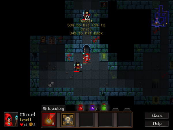
Mousing over an enemy will now give you your chances to hit and get hit. There’s a similar display for the chance a spell will fail that shows up while spellcasting.

Another little fix here is the recharge timer on spells – the fireball spell there taking 8 turns to recharge. That’ll hopefully be a further guide to the impact of Spirit, though it might be unnecessary. As for Speed, I have no idea. You’ll just have to judge that by enemy movement.

Spell recharging is a pain. What really complicates it is that Spirit makes recharging faster, but Speed makes it (subjectively) slower. Objectively speaking, spells take the same amount of game time to recharge – but your turns happen faster! It’s a hard problem to fix. I could have spells charge faster when your Speed stat increases, meaning they take the same number of turns… but that makes the Speed stat even more powerful.

It might be a necessary compromise for the sake of clarity. I could try balancing it that way – make Spirit more important, accept that the Speed stat is part of a magic-casting character build unless matched with a really low Spirit, and make Speed points rare and valuable.

Well, this project’s still in the early stages, so I have the flexibility to try out stuff like that. 🙂 I’ll give it a shot!

Jan 27 2012

INVENTORY

I’m getting rid of it, piece by piece. 🙂 I’m now handling item and spell management entirely with popup dialogs when you find stuff. Anything you don’t want will either be sold or left on the dungeon floor for you to revisit later.

First up, that ‘Found Item’ dialog got a slight revamp once it went in game. The “Keep” button was confusing as heck; did it mean you were keeping the new item, or keeping the item it was under? So I moved the buttons around.

I also changed its behaviour to sell the unwanted item, because the levels were getting a bit cluttered with rubbish gear. Now you’re either equipping the item on the right or selling it. It’s not perfect – I’ll probably have to clarify that you currently have the item on the left equipped already and we’re looking at the one on the right – but it’s getting there.

Either way, you’re going to end up with one item equipped. The other one will be sold and destroyed.

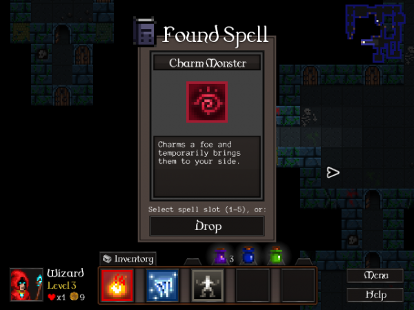
Spells require a different approach. You’ve got to chuck them into a spell slot. Rather than wiring up something so you could compare spells to each other, I just went with this:

Spells aren’t as simple as items; they have all these different unique effects. You might try spells out and then change your mind about them! Because of that, spells can’t be destroyed. Any spell you replace, or choose not to equip, will stay on the floor for later in case you change your mind.

When you find a spell on the floor, it’s going to start fully charged so you can cast it immediately and see how it works. This is all just about making things as transparent and self-explanatory as possible.

There’s now no reason whatsoever in the game to use the inventory. Next job is to look at merging the equipped items display from the Inventory screen into the Character screen somewhere. Then I can ditch the Inventory screen and its access button entirely!

That ought to be done by Monday. I’m looking forward to moving on from UI work and getting some more content in. 😀

Jan 25 2012

EQUIP?

Cardinal Quest had automatic inventory management. When you picked something up the system looked at the stats and either equipped it, stashed it in your inventory or sold it on for later.

We’re making two major changes to how you interact with items. Firstly, we’re probably going to streamline the inventory somehow, at least so you can’t carry stuff between levels and don’t end up carting around a few rows of junk. The inventory filling up was always an annoyance, and it’s only going to get worse with more unique items to find! Secondly, the system won’t make item decisions for you any more. I want people to feel more involved in how their character shapes up.

That’s the current mockup. No recommendation as to what item you should take, just a list of stat differences so you have the information you need to be smart and figure it out yourself. There’ll be a similar dialog for spells and, perhaps, for potions and other consumables (unless we keep the same system as now, where you have exactly five kinds of potion that stack).

Right now I’m trying to eliminate the rubbish aspects of inventory management clearing out junk but also eliminate backtracking. More on all of that on Friday.

Jan 23 2012

SYSTEM DESIGN

Today I’ve been reworking how combat stats (most importantly attack and defense) function in Cardinal Quest II. This blog entry’s going to be quite dry and mathsy, so if that’s not your bag feel free to come back on Wednesday when I’ll have more screenshots. 😀
See, design work isn’t all about interfaces and player choice. In many games you also have these systems on the back end handling damage, % to hit, movement speed, etc. This is where tables of statistics come in, and balancing those statistics is super important to balance units – but before that you need to nail down how the statistics interact, what calculations they get involved in, and that’s system design.

Cardinal Quest 1’s “chance to hit” formula is the main thing I’ve been tweaking today. It uses two stats – the attacker’s Attack stat and the defender’s Defense stat.

% to Hit = 100 * Attacker.attack / (Attacker.attack + Defender.defense);

To really understand how even a pretty simple formula works you need to visualise it. It’s a good place to break out a spreadsheet, run the numbers and draw some graphs.
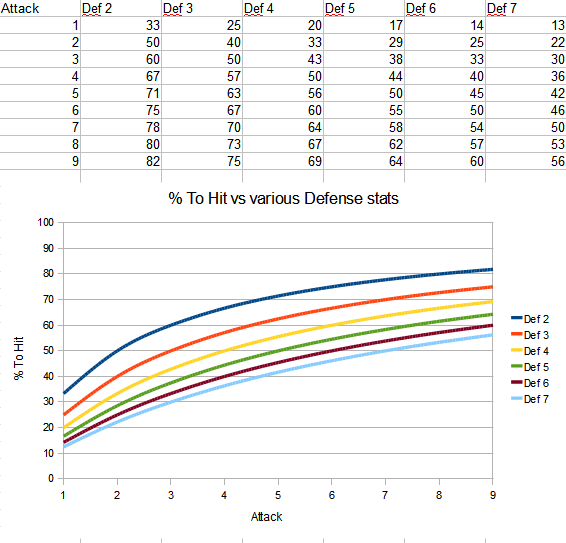
The important thing is, the lines go up! The higher your attack stat, the more often you’ll hit your target. Also, lower Defense stats on your enemy mean you’ll hit them more often.

That’s groovy, but… there are some issues here. Firstly, the exact number for each stat gets less important the bigger it is. The difference between 1 attack and 2 attack or 1 defense and 2 defense is huge, but there’s hardly any difference going from 6 to 7.  Secondly, almost all of our % to hit calculations are bunched in between 40% and 70% to hit. That’s going to make our classes feel a bit samey in melee combat.

We’ve got a system where, halfway through the game, adding 20% to your attack can alter your chance to hit by less than 5%. That was fine for CQ 1, but in Cardinal Quest 2 with its talent tree system, every single point needs to matter. So this has to change.

Here’s where we need to lay down some goals for redesigning the system.

Continue reading »
Jan 20 2012

CHARACTER DEVELOPMENT

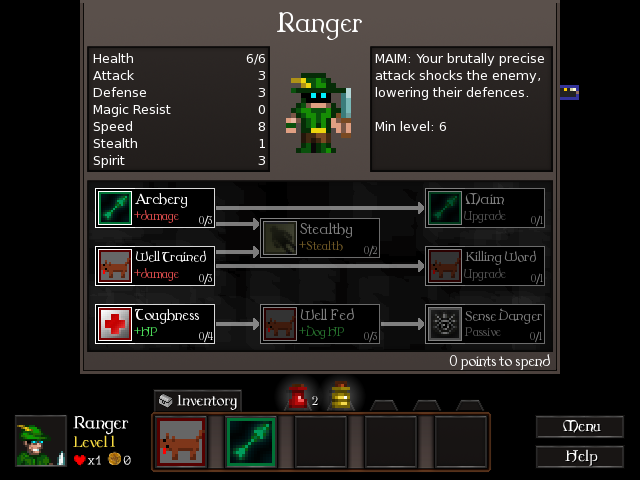
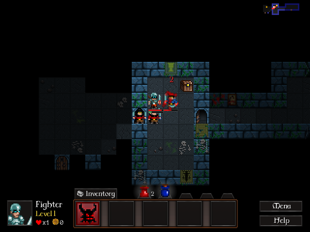
I’ve gone over the in-game UI for Cardinal Quest II, but there are plenty of other interface changes going in. My current focus is the Character Screen, which was a straightforward list of attributes before but is now gaining a ‘talent tree’ system for levelling up and customising your chosen class.

I’ll spare you the old version and the mockup. Here’s what came out of the process:

Continue reading »

Jan 16 2012

USER INTERFACE

Of all the various aspects of game design, UI has to be the one that comes closest to design proper. Functionality’s a given – what you’re concerned with is making that functionality logical, clear and a pleasure to use, so even complicated things feel simple.

Cardinal Quest’s interface had everything it needed, but it kinda dominated the screen.

(All these images are resized slightly – click through for the correct resolution.)

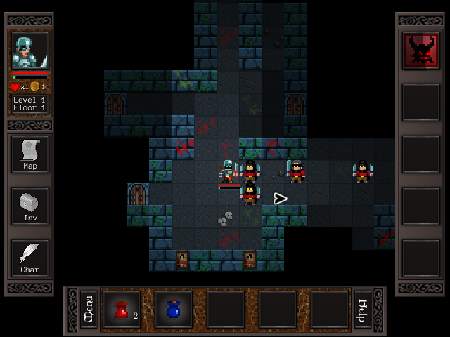
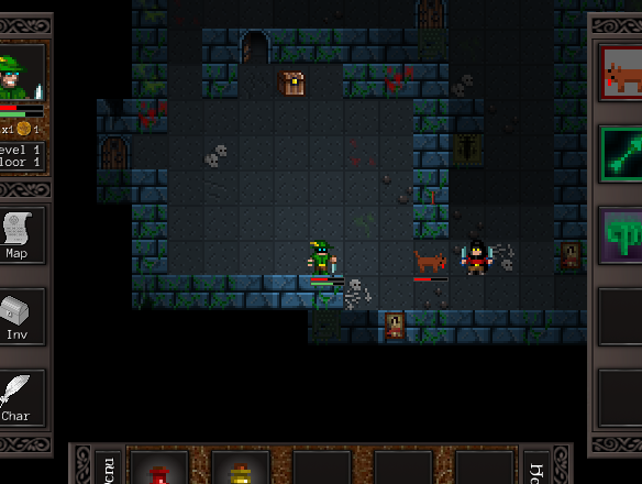
It’s an effective UI and it shows you everything you can do, but it wasn’t necessarily that efficient with screen real estate and it could feel a bit overwhelming the first time you brought it up.

Here’s the rough draft of the new UI for CQ2 – essentially a quick attempt to see how everything will be laid out, how it’ll work over the game graphics and whether everything will be spaced and arranged nicely.

Continue reading »

Jan 13 2012

THE POWER TO MOVE YOU

Coming up with fun, distinct new classes means drawing inspiration from a bunch of different places. Class number 5 in Cardinal Quest’s roster is going to be the Pugilist, an unarmed badass of a brawler who’s happiest out in the open. That’s not normal for roguelikes, so he has some unusual skills.

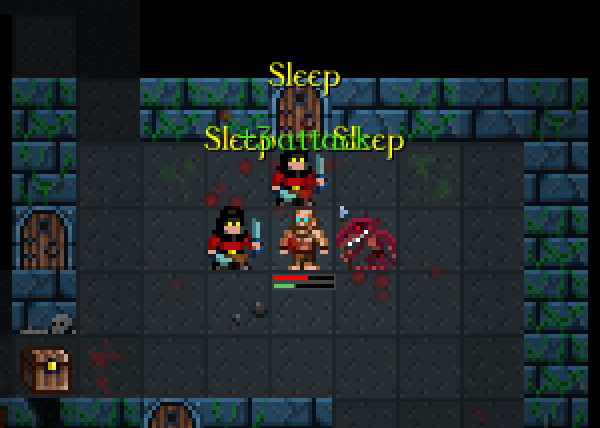
The main one is Sweep, a move which stuns everyone around him for several turns and gives him a temporary +1 attack, +1 defense buff for each person he hits with the move. If he’s in the middle of a crowd, he stuns all of them and gets a +4, +4 buff.

Continue reading »

Jan 06 2012

DOG

It’s a bold new year! I’m starting serious work on CQ2!

The first thing I like to do on any major project or bit of work is sort out design questions – the real “is this fun, is it interesting” stuff. CQ2 involves a fair bit of new content, so naturally I’ve started with the most straightforward – the new classes. What’s going to be cool and different about them?

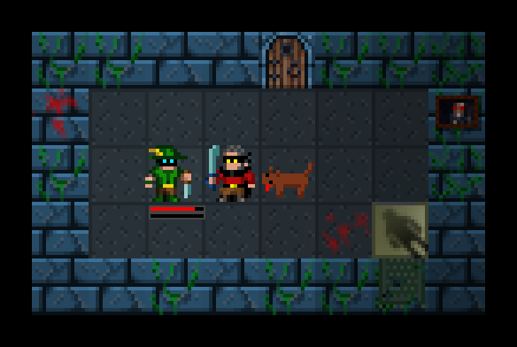
Something I wanted to try out was giving the new Ranger class a dog, and what do you know…

this guy is so awesome. He runs around excitably looking like an idiot, he attacks enemies, you can use a skill to order him to run places or attack guys, he heals by himself, and if he gets too badly wounded to go on fighting you can charge up a spell to heal him up. The Ranger’s now my favourite class and I’m seriously struggling to figure out how to make the other classes just as awesome.

Yup. I have added a dog to this game. It has created an EMOTIONAL CONNECTION.

I am now Peter Molyneux.

Dec 31 2011

YEAR IN REVIEW

A year ago, I’d just quit a safe job as a games programmer to do my own thing for a bit. I had savings to cover a year’s living expenses, and no idea how easy making a living at this would be. Now feels like a good time to review how that year went!

Back when I quit Frontier, in November 2010… I’ll be honest, I was really scared about whether I’d make any money this year. I was worried I wouldn’t be able to make games people enjoyed. I honestly thought I’d be looking for a job around now.

Continue reading »